The graph below shows the number of tourists visiting a particular Caribbean island between 2010 and 2017.Summarise the information by selecting and reporting the main features, and make comparisons where relevant.
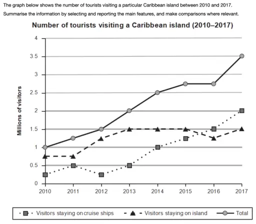
The rendered data in the form of a line graph depicts the number of visitors that traveled to a certain […]
The chart below shows the changes that took place in three different areas of crime in New Port city center from 2003 to 2012.
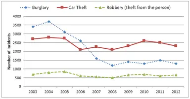
The rendered data in the form of a line graph delineates the information about the incidents in terms of three […]
The line graph below shows the production of paper, wood pulp and swan-wood in the UK from 1980 to 2000.
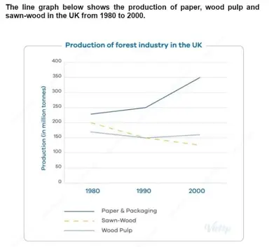
The rendered data in the form of a line graph delineates the information about the fabrication of the forest industry […]
The graph below shows the percentage of Australian exports to 4 countries from 1990 to 2012.

SAMPLE ANSWER: The rendered data, in the form of a line graph, delineates information about the proportion of Australia’s trade […]